Analysing performance
Overview
Teaching: 30 min
Exercises: 30 minQuestions
How do I analyse the results of my benchmarking?
Which metrics can I use to make decisions about the best way to run my calculations?
What are the aspects I should consider when making decisions about parallel performance?
What stops my HPC use from scaling to higher node counts?
Objectives
Understand how to analyse and understand the performance of your HPC use.
Understand speedup and parallel efficiency metrics and how they can support decisions.
Have an awareness of the limits of parallel scaling: Amdahl’s Law and Gustafson’s Law.
In the last section we talked about performance metrics and how to gather benchmark data and used an simple example program as an example. In this section we will look at how to analyse the data we have gathered, start to understand performance and how to use the analysis to make decisions.
Plotting performance
As well as providing a spreadsheet interface to allow us to manipulate data, VisiData also allows us to produce scatter plots in the terminal to quickly look at how the performance varies with core count.
First, let’s load the performance data into VisiData again:
module load cray-python
module load visidata
vd benchmark_perf.csv
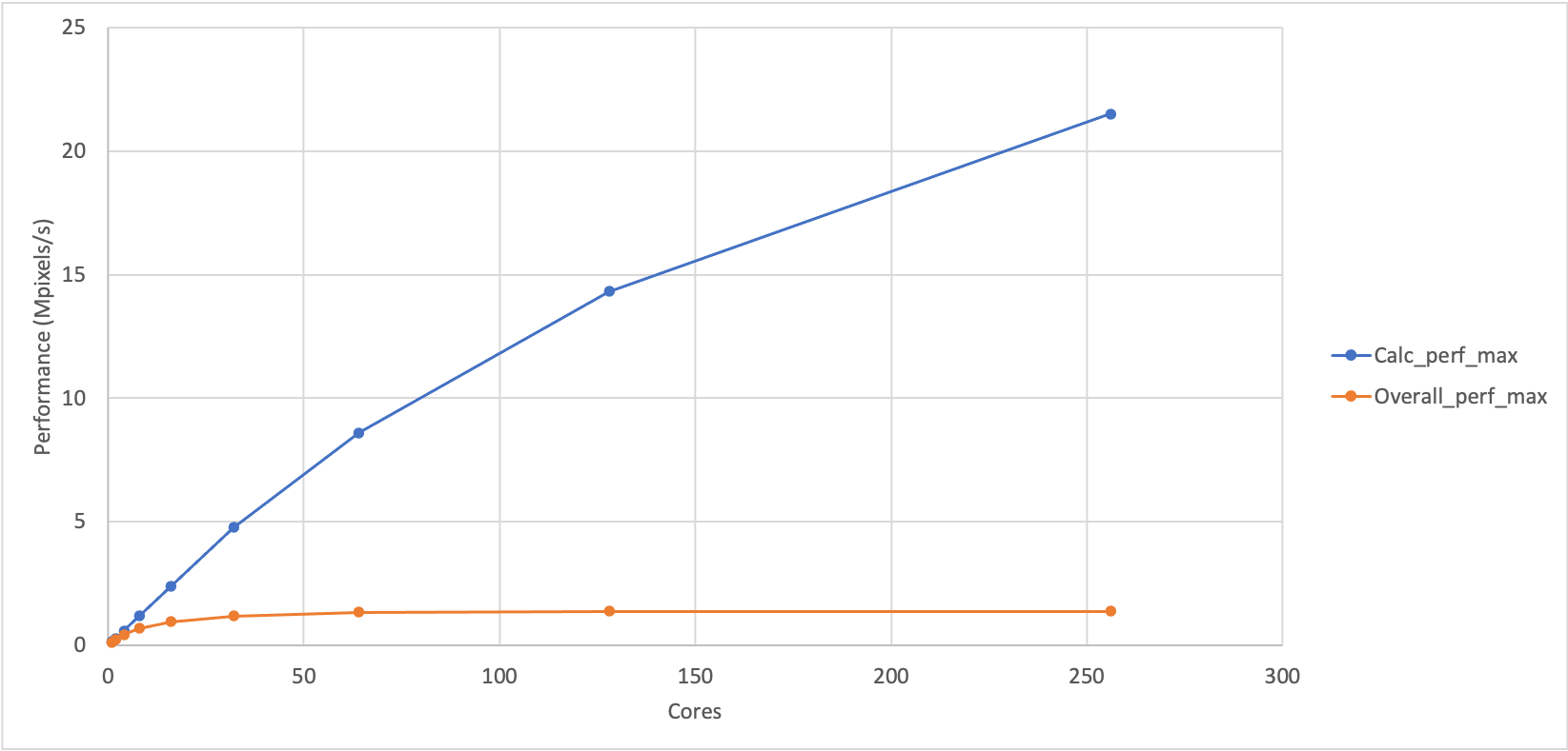
 Cores | count | Size_min | Calc_min | Calc_perf_max | Overall_min | Overall_perf_max ║
 1     | 3     | 0.43     | 2.84     | 0.15          | 3.10        | 0.14             ║
 2     | 3     | 0.43     | 1.43     | 0.30          | 1.68        | 0.26             ║
 4     | 3     | 0.43     | 0.72     | 0.60          | 0.97        | 0.44             ║
 8     | 3     | 0.43     | 0.36     | 1.19          | 0.61        | 0.70             ║
 16    | 3     | 0.43     | 0.18     | 2.39          | 0.45        | 0.96             ║
 32    | 3     | 0.43     | 0.09     | 4.78          | 0.36        | 1.19             ║
 64    | 3     | 0.43     | 0.05     | 8.60          | 0.32        | 1.34             ║
 128   | 3     | 0.43     | 0.03     | 14.33         | 0.31        | 1.39             ║
 256   | 3     | 0.43     | 0.02     | 21.50         | 0.31        | 1.39             ║

1› benchmark_perf|                                     KEY_RESIZE  redraw         9 rows
As noted earlier, VisiData allows us to show scatter plots in the terminal to get a quick visual representation of the relationship between the data in different columns. To do this, we need to make sure the columns are set to the correct numerical data types and say which one is going to be the x-axis.
Select the “Cores” column and hit # to set it as integer data,
next select the “Calc_perf_max” column and hit % to set it as floating point
data, finally select the “Overall_perf_max” column and hit % to set it as
floating point data too. Your terminal should now look something like:
 Cores#| count | Size_min | Calc_min | Calc_perf_max%| Overall_min | Overall_perf_max%║
     1 | 3     | 0.43     | 2.84     |          0.15 | 3.10        |             0.14 ║
     2 | 3     | 0.43     | 1.43     |          0.30 | 1.68        |             0.26 ║
     4 | 3     | 0.43     | 0.72     |          0.60 | 0.97        |             0.44 ║
     8 | 3     | 0.43     | 0.36     |          1.19 | 0.61        |             0.70 ║
    16 | 3     | 0.43     | 0.18     |          2.39 | 0.45        |             0.96 ║
    32 | 3     | 0.43     | 0.09     |          4.78 | 0.36        |             1.19 ║
    64 | 3     | 0.43     | 0.05     |          8.60 | 0.32        |             1.34 ║
   128 | 3     | 0.43     | 0.03     |         14.33 | 0.31        |             1.39 ║
   256 | 3     | 0.43     | 0.02     |         21.50 | 0.31        |             1.39 ║

1› benchmark_perf|                                          %  type-float         9 rows
Now we will set the “Cores” column as the x-axis variable. Select the “Cores”
column and hit ! - it should change colour (it is now blue in my terminal)
to show it has been set as the categorical data.
Finally, we can plot the graph by hitting g. (g followed by a period). You
should see something like the plot shown below which shows the variation of
maximum performance for the calculation part of Sharpen and the overall
performance of Sharpen (calculation and IO). (We have also included a plot
of the same data in Excel as it is difficult to see the terminal plot in the
web interface for the course.)
21.50                                                                 1:Calc_perf_max ⠁
                                                                      2:Overall_perf_max


16.16

                                                ⠂


10.82


                             ⠂


5.48
                   ⠁

              ⠠
            ⡀      ⡀         ⠄                  ⠄                                     ⠄
0.14      ⢠⠆⠂ ⠈
Cores»    1                  64                 128                192                256
2› benchmark_perf_graph| loading data points | loaded 18 points (0  g.          18 plots
Plotting timing data
Use Visidata to plot the timing data rather than the peformance. Looking at the timing plot, can you think of a reason why plotting the performance data is often preferred over plotting the raw timing data.
What does this show?
You can see that the performance of the calculation part and the overall performance look different. Can you come up with any explanation for the difference in performance?
Solution
If the overall calculation was just dependent on the performance of the sharpening calculation then it would show similar performance trends to calculation part. This indicates that there is something else in the sharpen program that is adversely affecting the performance as we increase the number of cores.
Analysis
We are going to analyse our benchmark data for the Sharpen example by looking at two metrics that we introduced earlier:
- Speedup: The ratio of performance at a particular core count relative to our baseline performance.
- Parallel efficiency: The percentage of perfect speedup that we observe at a
- particular core count.
Speedup
Compute the speedup for the maximum calculation and maximum overall performance
Using the data you have, compute the speedup for the maximum calculation and maximum overall performance. You can do this by hand, by using VisiData (this is what the solution will demonstrate), by downloading the CSV and using a spreadsheet software on your laptop (e.g. Excel) or by writing a script. Remember that the speedup is the ratio of performance to the baseline performance.
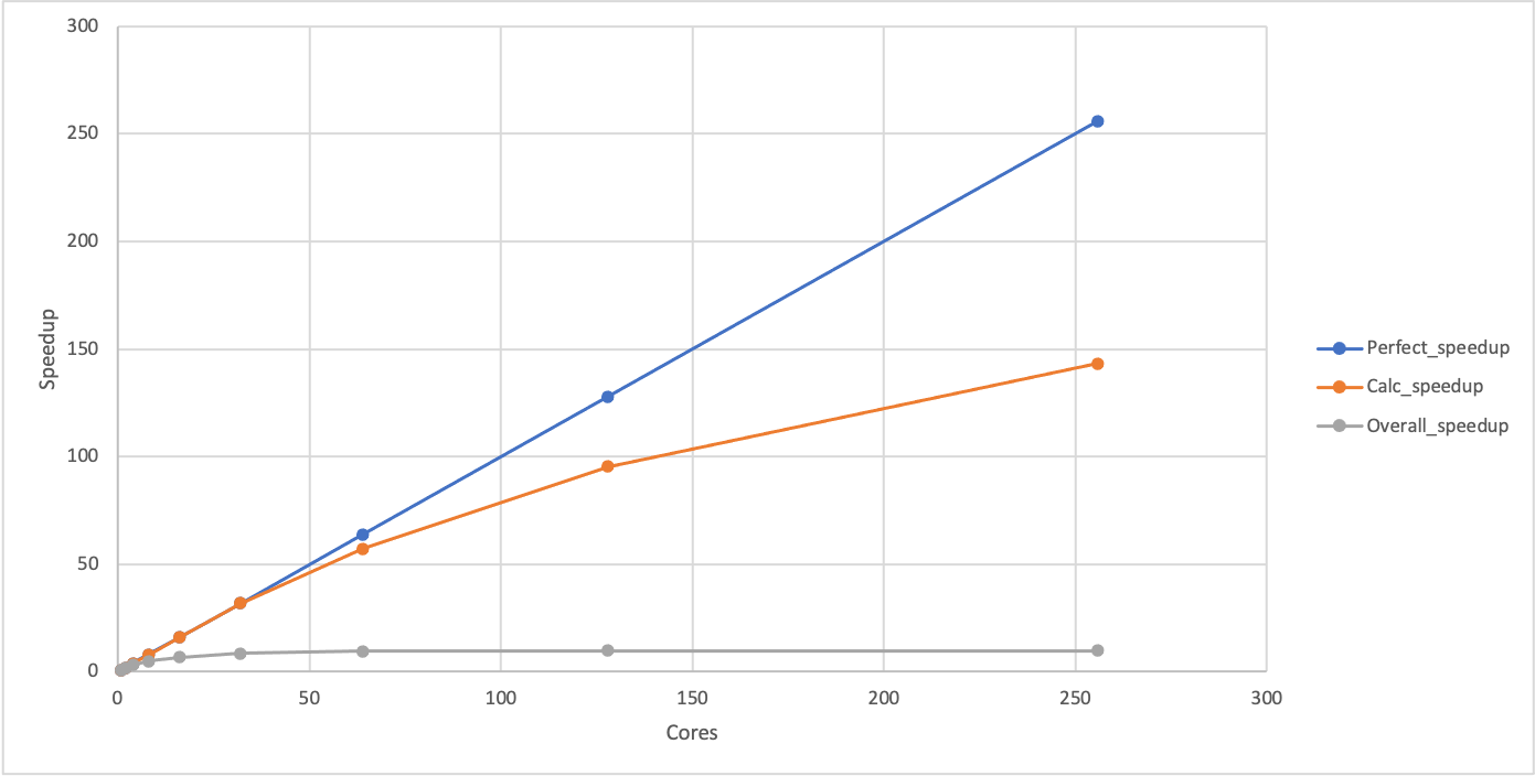
You should also add a column with the values for perfect speedup. As our baseline performance is measured on a single core, the perfect speedup is actually just the same as the number of cores in this case.
Finally, can you produce a plot showing the calculation speedup, the overall speedup and the perfect speedup?
In VisiData, you can create a column of data based on data in other columns by moving to the column to the left of where you want the new column to be, typing
=to start an expression and using the column names in the expression. For example, to produce a column that had all the data in the “Calc_perf_max” column divided by the value in the first row from “Calc_perf_max” (which, in my case, is 0.15) then you would enter=Calc_perf_max/0.15. You can rename a column by hitting^when the column you want to rename is selected. Remember, you will need to set the column data type before you can plot it. You can exclude columns from plots by hiding them by highlighting the column and hitting-. You can unhide all columns once you have finished plotting withgv.Solution
Computing speedup
Note the value for the “Calc_perf_max” on one core - this is the baseline performance we are going to use to compute the speedup, in my case it is 0.15. Highlight the “Calc_perf_max” column and create a new column with the speedup by entering
=Calc_perf_max/0.15and press enter (remember to replace 0.15 with your baseline performance). This should create a new column with the speedup. Highlight that column and hit%to set it as floating point data. Use^to rename the column asCalc_speedup. Repeat the process for the “Overall_perf_max” column (remember to use its baseline rather than the Calc baseline). Add a perfect speedup column by highlighting the “Cores” column and then entering=Coresand pressing enter. Change the name of this column to “Perfect_speedup” and set to integer data. Once you have done this, you should have a spreadsheet that looks something like (note some columns have scrolled off the right of my terminal):Cores#| Perfe#| count | Size_min | Calc_min | Calc_perf_max%| Calc_speedup %| Over> 1 | 1 | 3 | 0.43 | 2.84 | 0.15 | 1.00 | 3.10 2 | 2 | 3 | 0.43 | 1.43 | 0.30 | 2.00 | 1.68 4 | 4 | 3 | 0.43 | 0.72 | 0.60 | 4.00 | 0.97 8 | 8 | 3 | 0.43 | 0.36 | 1.19 | 7.93 | 0.61 16 | 16 | 3 | 0.43 | 0.18 | 2.39 | 15.93 | 0.45 32 | 32 | 3 | 0.43 | 0.09 | 4.78 | 31.87 | 0.36 64 | 64 | 3 | 0.43 | 0.05 | 8.60 | 57.33 | 0.32 128 | 128 | 3 | 0.43 | 0.03 | 14.33 | 95.53 | 0.31 256 | 256 | 3 | 0.43 | 0.02 | 21.50 | 143.33 | 0.31 1› benchmark_perf| KEY_LEFT go-left 9 rowsAt this point, you should save the file as
benchmark_speedup.csv.Plot speedup
Hide the “Calc_perf_max” and “Overall_perf_max” columns by highlighting them one at a time and hitting
-. Highlight the “Cores” column and hit!to set it as the categorical data. This should show a plot that looks something like:256 1:Perfect_speedup 2:Calc_speedup 3:Overall_speedup 192 ⠄ 128 ⠁ ⡀ 64 ⠄ ⠁ ⠁ ⠠ 1 ⢀⠄⠆ ⠐ ⠁ ⠁ ⠁ ⠁ Cores» 1 64 128 192 256 3› benchmark_perf_graph| loading data points | loaded 27 points (0 g. 27 plotsYou can see that the calculation speedup is much closer to the perfect scaling than the overall speedup. You can use
qto get back to the spreadsheet view andgvto unhide the hidden columns.
Speedup and performance
If plotted, the speedup should show the same shape as the performance plot we produced earlier with the difference that it will start at 1 for a single core (where the baseline and the observed performance are identical). Given this, Why do we use the two different metrics in our analysis? In short, we do not have to, but it can be more convenient to work with speedup rather than performance when comparing to ideal parallel performance and it is also a useful step towards computing the parallel efficiency which is often a key dimensionless decision-making metric.
Plotting performance directly is generally better for showing the differences between different setups (e.g. different HPC systems, different software versions) as it avoids the choice of baseline that must be made when plotting speedup and gives a better indication of the absolute performance differences between the different setups.
Parallel efficiency
Now we have columns with the calculated speedups and perfect speedup we can use these to compute the parallel efficiency which is often a better metric for making decisions about what the right scale to run calculations.
Calculate the parallel efficiency
Add columns to your spreadsheet (or output if you wrote a script) that show the calculation parallel efficiency and the overall parallel efficiency. Remember, the parallel efficiency is the ratio of the observed speedup to the perfect speedup.
Given the parallel efficiencies you have calculated can you propose a maximum core count that can be usefully used for this Sharpen example - both in terms of overall and in terms of just the calculation part? Why did you choose these values?
Solution
We will illustrate the solution using VisiData. Select the “Calc_speedup” column and setup a new computed column using
=Calc_speedup/Perfect_speedup, Select the new column and set it as floating point and change the column name to “Calc_efficiency”. Do the same for the “Overall_speedup”. Once you have done this, you should have something that looks like (note some columns have scrolled off the right of my terminal):Cores#║ Perfe#| count | Size_min | Calc_min | Calc_speedup %| Calc_effciency %|> 1 ║ 1 | 3 | 0.43 | 2.84 | 1.00 | 1.00 |… 2 ║ 2 | 3 | 0.43 | 1.43 | 2.00 | 1.00 |… 4 ║ 4 | 3 | 0.43 | 0.72 | 4.00 | 1.00 |… 8 ║ 8 | 3 | 0.43 | 0.36 | 7.93 | 0.99 |… 16 ║ 16 | 3 | 0.43 | 0.18 | 15.93 | 1.00 |… 32 ║ 32 | 3 | 0.43 | 0.09 | 31.87 | 1.00 |… 64 ║ 64 | 3 | 0.43 | 0.05 | 57.33 | 0.90 |… 128 ║ 128 | 3 | 0.43 | 0.03 | 95.53 | 0.75 |… 256 ║ 256 | 3 | 0.43 | 0.02 | 143.33 | 0.56 |… 1› benchmark_perf| KEY_LEFT go-left 9 rows8 cores for the overall speedup (63% parallel efficiency) is the limit of useful scaling and 128 cores for the calculation speedup (75% parallel efficiency) is the limit of useful scaling from the values measured.
Anything less than 70% parallel efficiency is generally considered poor scaling and less than 60% parallel efficiency is generally considered not a reasonable use of compute time in normal workflow production. Of course, if the time to solution is critical (for example, responding to an urgent request for data) then it may be acceptable to run with very poor parallel efficiency to achieve a faster time to solution but it should be carefully considered if the compute cycles could be better used by running multiple calculations in parallel rather than the inefficient use of resources by scaling the single calculation beyond its limits. In this case, the overall speedup is not improving at all beyond 64 cores so using more than this is futile anyway.
Limits to scaling/speedup and parallel efficiency
As we have seen with this example, there are often limits to how well a parallel program can scale. By scaling, we mean the ability to use more resources on an HPC system. Most often this refers to nodes or cores but it can also refer to other hardware such as GPU accelerators or IO. In the sharpen case, we are talking about the scaling to higher core counts.
Strong and weak scaling
In HPC, scaling is usually referred to in terms of strong scaling or weak scaling and when interpreting performance data it is important that you know which case you are dealing with.
- Strong Scaling – total problem size stays the same as the amount of of resource (cores in this case) increases.
- Weak Scaling - the problem size increases at the same rate as the amount of HPC resource (cores in this case), keeping the amount of work per resource unit the same.
The image sharpening case we have been using is an example of a strong scaling problem.
Strong scaling is more useful in general and often more difficult to achieve in practice.
Weak scaling image sharpening?
Can you think of how you might use the image sharpening example to look at the weak scaling peformance of the code? What would you have to change about the way we run the program to do this?
The limits of scaling (as we have seen, usually measured in parallel efficiency) in the cases of both strong and weak scaling are well understood. They are captured in Amdahl’s Law (strong scaling) and Gustafson’s Law (weak scaling).
Strong scaling limits: Amdahl’s Law
“The performance improvement to be gained by parallelisation is limited by the proportion of the code which is serial” - Gene Amdahl, 1967
What does this actually mean? We can see what this means from the sharpen example that we have been looking at. The reason that this example stops scaling Overall even though the Calculation part scales well is because there is a serial part of the code (the IO: reading the input and writing the output). Here I have computed the IO time by subtracting the Calculation time from the Overall time. The “IO_min” column shows the time taken for the IO part and the “Fraction_IO” column shows what fraction of the total runtime is taken up by IO.
 Cores | Calc_min%| Overall_min%| IO_min              %| Fraction_IO        %║
 1     |     2.84 |        3.10 |                 0.26 |                0.08 ║
 2     |     1.43 |        1.68 |                 0.25 |                0.15 ║
 4     |     0.72 |        0.97 |                 0.25 |                0.26 ║
 8     |     0.36 |        0.61 |                 0.25 |                0.41 ║
 16    |     0.18 |        0.45 |                 0.27 |                0.60 ║
 32    |     0.09 |        0.36 |                 0.27 |                0.75 ║
 64    |     0.05 |        0.32 |                 0.27 |                0.84 ║
 128   |     0.03 |        0.31 |                 0.28 |                0.90 ║
 256   |     0.02 |        0.31 |                 0.29 |                0.94 ║

1› benchmark_perf|                                  -  hide-col         9 rows
What do we see? The IO time is constant as the number of cores increases, indicating that this part of the code is serial (it does not benefit from more cores). As the number of cores increases, the serial part becomes a larger and larger fraction of the overall run time (the calculation time decreases as it benefits from parallelisation). In the end, it is this serial part of the code that limits the parallel scalability.
Even in the absence of any overheads to parallelisation, the speedup of a parallel code is limited by the fraction of serial work for the application (parallel program + specific input). Specifically, the maximum speedup that can be achieved for any number of parallel resources (cores in our case) is given by 1/α, where α is the fraction of serial work in our application.
If we go back and look at our baseline result at 1 core, we can see that the fraction of serial work (the IO part) is 0.08 so the maximum speedup we can potentially achieve for this application is 1/0.08 = 12.5. The maximum speedup we actually observe in is around 10 (because the parallel section does not parallelise perfectly at larger core counts due to parallel overheads).
Lots of parallelisation needed…
If we could reduce the serial fraction to 0.01 (1%) of the application then we would still be limited to a maximum speedup of 100 no matter how many cores you use. On ARCHER2, there are 128 cores on a node and typical calculations may use more than 1000 cores so you can start to imagine how much work has to go into parallelising applications!
Weak scaling limits: Gustafson’s Law
For weak scaling applications - where the size of the application increases as you increase the amount of HPC resource - the serial component does not dominate in the same way. Gustafson’s Law states that for a number of cores, P, and an application with serial fraction α, the scaling (assuming no parallel overheads) is given by P - α(P-1). For example, for an application with α=0.01 (1% serial) on 1024 cores (8 ARCHER2 nodes) the maximum speedup will be 1013.77 and this will keep increasing as we increase the core count.
If you contrast this to the limits for strong scaling given by Amdahl’s Law for a similar serial fraction of code and you can see why good strong scaling is usually harder to achieve.
Why not always use weak scaling approaches?
Given the better prospects for scaling applications using a weak scaling approach, why do you think this approach is not always used for parallelising applications on HPC systems?
Solution
In many cases, using weak scaling approaches may not be an option for us. Some potential reasons are:
- An increased problem size has no relevance to the work we are doing
- Our time would be better used running multiple copies of smaller systems rather than fewer large calculations
- There is no scope for increasing the problem size
Summary
Now we should have a good handle on how we go about benchmarking performance of applications on HPC systems and how to analyse and understand the performance. In the next section we look at how to automate the collection and analysis of performance data.
Key Points
You can use benchmarking data to make decisions on how to best use your HPC resources.
Parallel efficiency is often the key decision metric for limits of parallel scaling.
Parallel performance is ultimately limited by the serial parts of the calculation.